Builder

Screen type previews

Schematic, content-free wireframes of each screen layout — used by the type picker so authors recognise a format at a glance. Pure DOM + design-system tokens, so they track the theme.

Cover
Course break
Text
Full media
Multiple choice
Image choice
True/False
Short response
Survey
Matching
1
2
3
Ordering
Compact (60px)
1
2
3
Cover screens

Cover screens open a module — they're intros, not graded steps. Authors pick a layout in the inspector (Panel, Title top, or Full bleed) and can set eyebrow, headline, media, and on full bleed: a content-type chip and optional due date.

All covers share the same ScreenView the builder edits — previews here are literal zooms of the phone, not a separate mini-layout.

Panel · media_topTitle top · text_topFull bleed · media_full

Panel

Image on top, brand-colored panel below. Eyebrow + display title sit on the accent surface. Default cover layout.
layout media_top

Title top

White header with eyebrow and title; media sits below in a framed inset with the phone's white padding.

layout text_top

Full bleed

Media fills the screen. Glass module chip and due-date pill float at the top; the title sits on a bottom scrim.

ModuleDue in 7 days

layout media_full

Full bleed · no deadline

Same full-bleed layout without a due-date pill — only the content-type chip shows.

Course

layout media_full

Panel · fit image

Panel layout with media fit set to contain — image letterboxes on a full brand surface with no white inset.
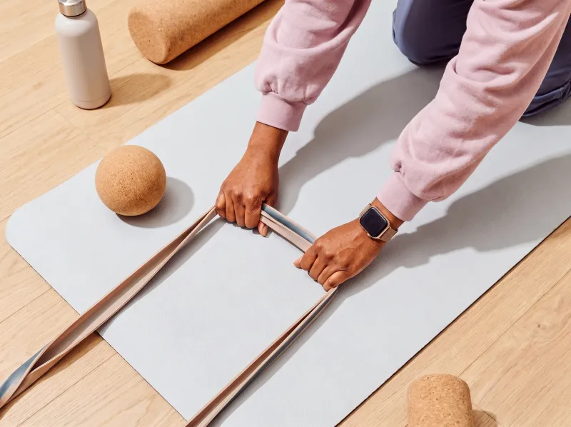
layout media_top

Generating media

While the agent drafts a cover image, the media slot shows the status-ai generating state until media resolves.

Generating image

layout media_top

Typography

Every text style used in the builder — phone canvas (ScreenView), editor chrome, and plan/publishing surfaces. Each row shows a live sample, the size token, and the Tailwind classes from the source.

Builder typography composes three atomic tokens — size, weight, and color — rather than fixed composite classes. Phone headlines pair font-heading (Inter Display, opsz 32) with text-title1 or text-title1-compact. Body copy on learner screens uses the screen-body utility — large size, normal weight, refined letter-spacing.

Phone canvas

Typography inside ScreenView — the canonical 290×580 learner phone. Headlines use font-heading (Inter Display, opsz 32).

Cover eyebrow

Small label above cover titles (title-top layout)

mini · 12px

New partner

text-mini font-semibold uppercase tracking-[0.14em] text-text-tertiary

Cover eyebrow · panel

Eyebrow on the brand accent panel

mini · 12px

New partner

text-mini font-semibold uppercase tracking-[0.14em] opacity-80

Cover title · title top

Display title on title-top covers

title1 · 36px

Your first week

font-heading text-title1 font-semibold leading-[1.05] tracking-tight text-text-primary

Cover title · panel / bleed

Display title on panel and full-bleed covers

title1-compact · 30px

Welcome to the team

font-heading text-title1-compact font-semibold leading-[0.95] tracking-tight

Cover title · full bleed

Title overlaid on photography with scrim

title1-compact · 30px

Onboarding

font-heading text-title1-compact font-semibold leading-[0.95] tracking-tight drop-shadow-md text-white

Glass chip

Module label and due-date pills on full-bleed covers

mini · 12px

Module

glass-surface inline-flex rounded-full px-2.5 py-1 text-mini font-medium text-[var(--color-gray-0)] antialiased

Section break

Centered title on course-break screens

title2 · 24px

Welcome

text-title2 font-semibold

Content headline

Headline on text+media and question screens

large · 18px

Your first day

text-large font-semibold

Content body

Paragraph copy on text+media screens

large · 18px + screen-body

What to expect when you arrive on the floor.

screen-body text-large font-normal leading-[1.25] text-text-secondary

Media caption

Caption under full-media and video screens

small · 14px

Safety gear

text-small font-medium text-white drop-shadow-sm

Next button

Primary CTA at the bottom of learner screens

small · 14px

Next

inline-flex rounded-full bg-action-secondary px-4 py-2 text-small font-medium text-action-secondary-foreground

Quiz option

Multiple-choice and image-choice answer rows

small · 14px

Front desk

text-small

True / false pill

Binary answer buttons

small · 14px

True

rounded-md border border-border-primary px-2.5 py-1.5 text-small font-normal normal-case tracking-normal

Field label

Matching pair labels and editor hints

tiny · 10px

Pair 1

text-tiny font-medium uppercase tracking-wide text-text-tertiary/70

Order index

Number beside ordering items

mini · 12px

1

text-mini tabular-nums text-text-tertiary

Draft badge

AI-drafted screen marker

mini · 12px

Draft

rounded-full bg-action-primary px-2.5 py-1 text-mini font-medium text-action-primary-foreground

Generating label

Media slot while the agent is working

mini · 12px

Generating image…

text-mini font-medium text-status-ai-text

Builder chrome

Typography in the editor shell — inspector, outline, filmstrip, and top bar. Sized for density at desktop scale.

Field label

Inspector and module-editor section labels

micro · 11px

Cover style

text-micro font-semibold uppercase tracking-wider text-text-tertiary

Outline section

Section headers in the outline rail

smaller · 13px

Screens

text-smaller font-medium leading-none text-text-tertiary

Nav item

Outline tree rows and inspector tabs

small · 14px

Your first day

text-small font-medium

Inspector input

Text fields in the inspector panel

small · 14px

Innovation Mindset

text-small text-text-primary

Helper text

Hints, meta lines, and upload constraints

mini · 12px

PNG, JPG or MP4 · up to 50MB

text-mini text-text-tertiary

Filmstrip index

Screen number beside filmstrip thumbnails

mini · 12px

3

text-mini tabular-nums text-text-tertiary

Top bar title

Course name in the builder header

small · 14px

Onboarding

text-small font-semibold

Add screen

Ghost phone and seam insert affordances

small · 14px

Add screen

text-small

Agent status

Building / generating banners in the feed

mini · 12px

Building screen…

text-mini text-status-ai-text

Plan & publishing

Typography in the plan doc, module overview, and item editors outside the phone canvas.

Document title

Editable plan and item editor headings

title2 · 24px

Warehouse onboarding

text-title2 font-semibold tracking-tight

Section heading

Plan doc section labels (Objectives, Steps)

mini · 12px

Objectives

text-mini font-semibold text-text-secondary

Body copy

Plan descriptions and overview paragraphs

small · 14px

Four sections drafted from your uploaded handbook.

text-small text-pretty text-text-tertiary

Step index

Numbered steps in the plan doc

tiny · 10px

2

grid size-5 place-items-center rounded-full bg-bg-secondary text-tiny tabular-nums text-text-tertiary

Overview title

Module overview card headings

regular · 16px

Self-enrollment

font-heading text-regular font-medium text-text-primary

Status chip

Check-in and workflow status badges

tiny · 10px

Draft

rounded-full border border-status-warning-border bg-status-warning-bg px-2 py-0.5 text-tiny font-medium text-status-warning-text

Screen filmstrip

Every course screen type in one filmstrip — cover, text, full media (image and video), course break, multiple choice, image choice, true/false, short response, survey, matching, and ordering. Drag to reorder, hover for duplicate / delete, click to open in the editor below, or use the trailing tile to add.

1
Module7 days
2
3
4
5
6
7
8
9
10
Worker types the answer…
Accepted answer
11
Worker writes freely…
Survey · not graded
12
13
1.
2.
3.
4.

Learners see these shuffled.

Screen editor

The full-screen phone editor from the builder. Scroll the feed to move between screens (selection follows the centered phone), edit the centered screen inline, and add screens from the seams or the ghost phone at the end.

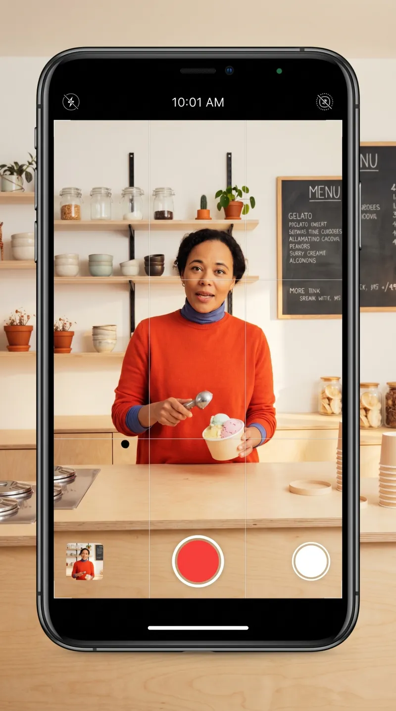
Record on your phone

New.Film a quick walkthrough on your phone — we'll add it to your module and automatically split it into screens.

Module7 days
Screen 4
Worker types the answer…
Accepted answer
Worker writes freely…
Survey · not graded
1.
2.
3.
4.

Learners see these shuffled.

1
2
3
4
5
6
7
8
9
10
11
12
13
Read-only filmstrip

Without onDuplicate / onDelete / onAdd, the strip becomes a static, reorderable gallery — useful for previews and summaries.

1
Module7 days
2
3
4
5
6
7
8
9
10
Worker types the answer…
Accepted answer
11
Worker writes freely…
Survey · not graded
12
13
1.
2.
3.
4.

Learners see these shuffled.